Timeline: May 2005–January 2006
Client approached us with a startup company, name, business description and the seedling for a logo per sketch. They wanted a mark that would be elegant and distinctive yet austere and restrained enough to appeal to the conservative MD community on whom they relied for their customer base. We worked interactively with client through numerous build-revs to reach this solution with integration into specific treatments as captioned.
business card fronts
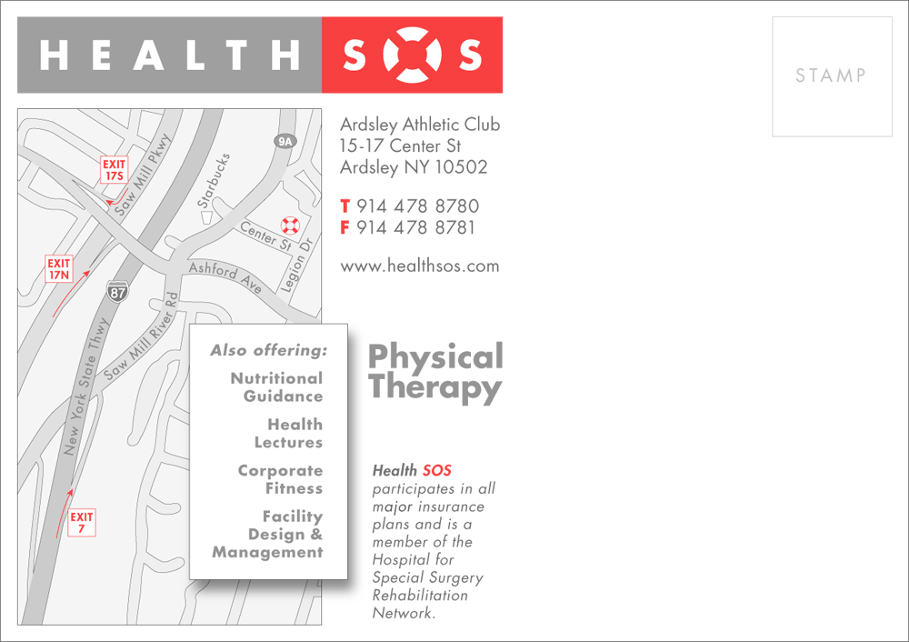
promotional postcard
holiday repurposing via vellum overlay
business card backs
letterhead + envelope
interim website homepage
promo sign for opening reception
positive logo variation for interior stainless steel wall sign
Sign
client sketch